Artwork Approval
We always quote delivery dates from ‘artwork approval’ so we suggest preparing your artwork to our guidelines.
We need to receive artwork in the correct format and ultimately this assures the best printed panels and on time delivery
If you need any help to create your artwork, we offer assistance, guides and if you drop us a line to info@novadura.com or even a call on 01282 867390, we’ll be happy to help!
Preferred Artwork
- Format – PDF or JPEG
- Colour – CMYK
- Bleed – 3mm
- Resolution – 300dpi
- Fonts – embedded/curves
- No printer marks or colour bars
- Do be aware that RGB and Pantone colours will be automatically converted to CMYK, which might affect the colour of your print (and we don’t want that!) – see our guides below
Download our artwork approval guidelines best practice guide HERE or by clicking on the image below.
If you have any other questions regarding formats or anything else regarding our products, please complete the the contact form provided.
Check out the ‘Guide’ links below to avoid common problems and be able to submit artwork using our preferred specs………..
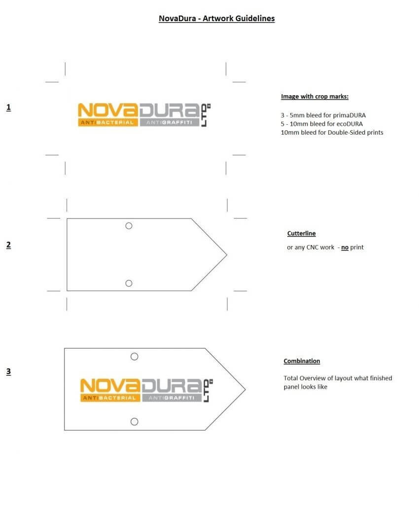
Print Bleed & Crop Marks
What Is Print Bleed and Why Is It Required?
It is impossible to cut exactly to the edge of your design without fear of a ‘white line’. Therefore an over print on each side is required to extend beyond the ‘crop marks’. This overprint is called ‘print bleed’.
How Much Bleed?
This can be product dependent and especially if we are producing double sided prints. Typical industry standard is to have 3mm of bleed on each edge and a 3mm safe zone inside. This means that the length of each side will be 6mm longer.
For example an A1 panel when lined up correctly with 3mm print bleed will be 847mm x 600mm. When trimmed down the finished size will be 841mm x 594mm.
However our ecoDURA product is processed using high temperatures and pressure. Consequently we ask for a minimum of 5mm bleed outside of the crop marks.
Internal Safe Zone?
It is advisable that there is a similar internal ‘safe zone’ within the cutting edge of at least 5mm. This avoids any cutting tolerances where the text could be clipped off. It also allows us to place any fixing holes that may be required. Typically we place 4 @ 6mm holes at 12mm centred from the edges.
Bleed and Safe zone
The diagram below shows our requirement for each product. If artwork is submitted in this format with the three distinct layer, artworks can be quickly approved and into production.
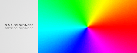
RGB and CMYK
This blog post is dedicated to colour spaces and the differences between RGB and CMYK colour gamuts. Furthermore to explain why CMYK should be used for commercially printed documents. Finally to show how to check the colour settings in most commonly used software packages…..Let’s go!
What is a colour space?
A colour space is simply an organization or range of colours. You can think of a colour space as palette of all the colours available for you to work with. The two colour spaces that are most common when working in Photoshop or Illustrator are RGB and CMYK.
What is the difference between the two?
RGB
RGB in an acronym for Red, Green, and Blue, and is the colour space used by electronic displays. You should work in RGB colour space if the final product is going to be presented digitally on a screen. Every colour in an RGB colour space is made of some combination of red, green, and blue.
CMYK
CMYK is an acronym that stands for Cyan, Magenta, Yellow, and Key (which is black). You should be working in a CMYK colour space if the final product is going to be printed. The palette of colours accessed in a CMYK colour space is made by mixing different amounts each.
CMYK versus RGB colour spectrum
The RGB colour spectrum is much larger than the CMYK spectrum. There are colours that can be created in RGB that are not available CMYK. This problem is most apparent with very bright colours such as a fluorescent orange or green. Commercial presses print onto white paper using CMYK colours. In order to get the best results files should be prepared with this in mind.
Whereas monitors emit light, inked paper absorbs or reflects specific wavelengths. Cyan, magenta and yellow pigments serve as filters, subtracting varying degrees of red, green and blue from white light. This gives a very selective gamut of spectral colours.
Like PC monitors, printing inks also produce a color gamut that is only a subset of the visible spectrum. However, the range is not the same for both. Consequently, the same artwork displayed on a computer monitor may not match to that what is printed.
The colour spectrum in an RGB colour space is vast. However, many of the colours are NOT able to be reproduced by a printer. Why not? Because the colours are just not able to be created by the mixing Cyan, Magenta,Yellow, and Black together. It uses a different palette of colours entirely.
If you do try and print out a file that was designed in RGB, you’ll notice that the colours look pretty different than on the computer. This is because the printer has to substitute all of the RGB colours that it cannot create with a combination of cyan, magenta, yellow, and black ink.
Visual representation
Below is an example of how the visual RGB spectrum can appear when printed in CMYK. Saturated vibrant colours on screen that are back-lit on a PC . The vibrant green on the screen looks bright and saturated. This is because the colours present in the design are made up of Red, Green, and Blue. These are also back lit on the computer.
Converting RGB Files to CMYK and Re-Balancing Colour
Using software such as Photoshop is possible to readjust the colour balance. After conversion to more closely match the intended colour output. If using RGB elements i.e. images in the design stage it is worth converting the elements into CMYK. This can re-balance the colours during the design process.
Creating Files in CMYK
When designing any file for us to print it’s important to set up and design the document in CMYK colour. This will save any problems trying to adjust colours afterwards which can be very difficult if not impossible. Not all software is able to create files in CMYK colour mode. For example Microsoft Word and Powerpoint are only able to create documents in RGB which must be converted before printing.
Do’s and Dont’s
Finally, a few pointers to help you understanding the issue and assist in checking.
- Do use printed CMYK colour swatches to check colours if unsure.
- Do check proofs on screen using a colour calibrated monitor (if possible). Be aware that with uncalibrated screens colours will vary from monitor to monitor.
- Do print samples using a commercial proof printer with output profile set to Fogra39.
- Do use Acrobat pro output preview tool to check colours when output to Fogra39.
- Don’t check colours against desktop printer samples as their profiles will generally try to emulate RGB colours as opposed to printing the true CMYK colours.